
Kodak Gold 200 photos on 120 film are pretty much everywhere now. The hype may have died down, YouTube video reviews aren’t being uploaded as much anymore and well, you’ve probably got a huge backlog of sample photos taken with Kodak’s latest 120 film release. But, and this is weird coming from a photographer who shoots almost exclusively in black and white, the results below – from a single roll of the Gold stuff – felt good right off the scanner. A quick word, however; this is certainly not a film review of Kodak Gold 200. It is merely something I often search for; a quick look at some sample photos using a film stock I’m considering. The images below are my sample Kodak Gold 200 photos. Please enjoy.
Kodak Gold 200 - What's not to like!
Colour is not something I shoot all that often. I’m not comfortable with colour and it probably shows. I’ve not been shy about how much I’ve struggled with colour film, especially since developing my own at home. But let me tell you about Kodak Gold 200.
How to expose Kodak Gold 200
This isn’t a hard rule. Everyone has and will probably voice their opinions on the best way to expose a certain film stock. But it is, in my opinion, based on opinions. LOL. Anyway to get the best results for my eye, I’m metering at ‘box speed’, y’know ISO 200. Ever so slightly over exposing the highlights or even sometimes exposing for the highlights, I find the colours are rich, full and delightfully saturated.
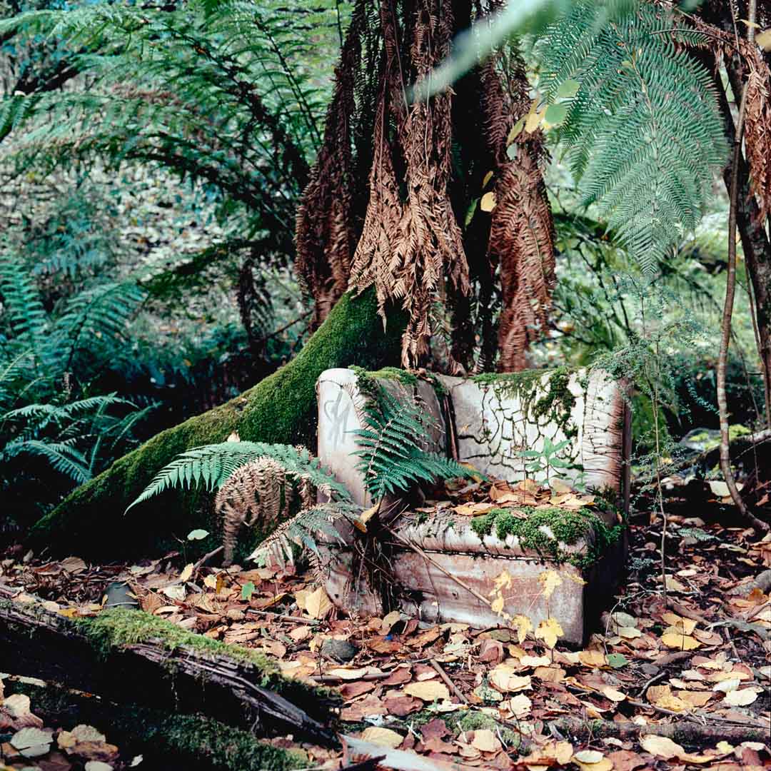
How does it look?
One thing I notice a bit when scanning Kodak Gold in and using Negative Lab Pro for my conversions is the obvious warm tone or ‘gold’ look to the images. I suppose that’s in the name of the film, right, so that to be expected.
The other thing that really makes me fall in love with Kodak Gold 200 are the greens in the shadows. I love my blues and magentas in Kodak’s Ektar film but the greens hit real nice in Gold 200. In particular, let’s say for example, in the sample photos below, there’s one of a stair case. The slight green tint in the shadows in the foreground, I think, are absolutely delightful.
What don’t I like about Kodak Gold 200?
I mean, despite it not being Ilford FP4+ or any other black and white film, what don’t I like about Kodak Gold 200 in 120 format? Answering this question had me stumped. I know that typing this sentence will jinx me, but Kodak Gold 200 seems to always turn out exactly how I envision the photographs. The ice-cream image for example, that was kind of rushed and I was in the way and people almost stood on the ice-cream while trying to avoid me but the warm gold tones with slight green hues in the shadows were all in the vision. Watching the scene play out in front of me, much like when I make photographs in black & white, I could see this image almost exactly as you see it here.
So with that, I’m going to leave it to you to form your own opinions. I’d love to hear them. Also, do you think I should I shoot more colour? Let me know!
Friday Bonus - Grainy Days
One of my favourite YouTube channels is the dry humour of Jason on Grainy Days. If you’ve a few minutes, check out this video from Jason and his experience with shooting Kodak’s Gold 200 colour film.


